This week You! peeks into the trendy boutique in Lahore...
interior
This week You! peeks into the trendy boutique in Lahore...

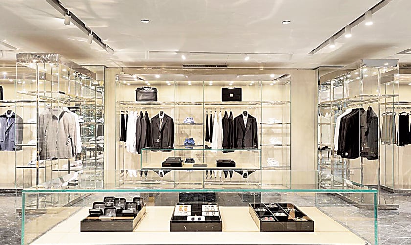
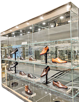
In the midst of a highly competitive era where every retailer wants to stand out among its contemporaries, it becomes quite challenging to design a space that is unique and attracts the customers as well. And this is exactly what brothers, Saqib and Usman Buksh, have tried to do with their newly opened store, ‘The Boutique’. The main highlight of the store is its interior which is all about steel and glass but a balanced execution has made everything gel so well. The store occupies a massive upper floor; housed in the modern structure of Madison Mall, Lahore. The interior has the vibe of a plush den featuring a subtle mix of contemporary style, impeccable finishing and affective store lighting that not only enhance the products on display, but create a wow factor for the customers. The entire space is designed in a cube form with see through standing mirrors creating an almost surreal feeling. The attention to details and unique facets are enhanced by large glass display boxes which is a perfect melange of classic, chic space.
A neutral based colour palette has been chosen for the showroom along with classic detailing and contemporary furniture for seating purposes. “It was a great challenge to create a multi-brand store but the architect we hired from Italy helped us in creating this visually inspiring interior in a way we wanted it to be. Paolo Giachi is the architect for Prada for almost ten years now. Since most of our brand partners are Italian we thought the right person to work with would be someone who understands the brands and the luxe environment that we wanted to create. Hence we teamed up with the architect, Paolo Giachi,” shares Saqib Buksh.
 According to Giachi, “My design philosophy has to do with my latest favourite visual experiences; things that have a strong impact on which could be from my travels, from nature or daily life events. It is the eye and the curiosity to look at things that surround me.”
The new space boasts of leading names with a strong design, ethos and creative aesthetics. This gigantic store is divided into two parts along the main bill counter. Upfront, the retail space is cut into separate sections by a sequence of walls, with ample cut-outs, interlude with display areas on both sides. About the design concept Giachi says, “It has been composed by the use of materials that convey luxury as it’s a part of the brand’s vision. Freestanding display units organize the large space, highlighting the products based on their type. The dark grey marble floor combined with the light colour palette on the walls provides a background for the polished stainless steel nickel displays which showcase the clothes and accessories. Central displays in dark grey back-painted glass paired with velvet curtains create a sensation of lightness and a game of perspectives, giving a touch of cutting edge sophistication. It’s a mix of materials that bring together contemporary atmosphere with a timeless touch.”
When asked about the flooring the architect shares, “Flooring is based on a herring bone pattern running across the entire area. It was getting too long for the marble to be cut and shipped here from Italy so they got it locally but it took sixty days for it to be cut into a specific design and angle.”
Regarding the store’s lavish setting, Saqib says, “Its layout, lighting and overall ambiance have been developed while keeping in mind the high end brands and products on display. The store has been designed to look and feel like a contemporary art gallery with long isles in the shoe section and interesting cosy corners within the store. The interior has been designed in such a way making it spacious and giving a pristine feel to it. In order to keep the focus on the products, we have made sure that the elements are not over powering. We wanted the space to look like the display area of a decorative art collector.”
Paolo Giachi further adds, “Lighting is a key, not just for the overall look and feel of the product and store, but to elevate one’s mood giving an overall feeling of wellbeing. To achieve an all-encompassing image we have used Italian lighting which is tailor made for luxury stores and products. The same lighting suppliers are used by most International Luxury brands.”
Also, the furnishing element has been well thought of especially in the trial area. “Plush sofas stationed here which gives a certain character to the area. One can’t ignore the vastness of the try rooms which have appropriate changing space in order to avoid getting claustrophobic,” elaborates the architect.
“This store is our labour of love and passion and we wanted to create an opulent environment keeping our niche clientele in mind. And that is exactly what our store is all about,” concludes Saqib Buksh.