This week You! peeks into the pristine interiors of a retail store in Lahore...
interior
This week You! peeks into the pristine interiors of a retail store in Lahore...
Any designer store that has an eye-catching interior with intriguing design and display elements, make your shopping experience worthwhile and you just can't resist visiting the place again and again. Of course, every store follows a different design strategy - depending on the merchandise that is being sold there. However, what captures our attention before anything else is how tastefully and painstakingly the place has been decorated. And this is exactly what the recently opened Sapphire Concept Store in Lahore is all about.
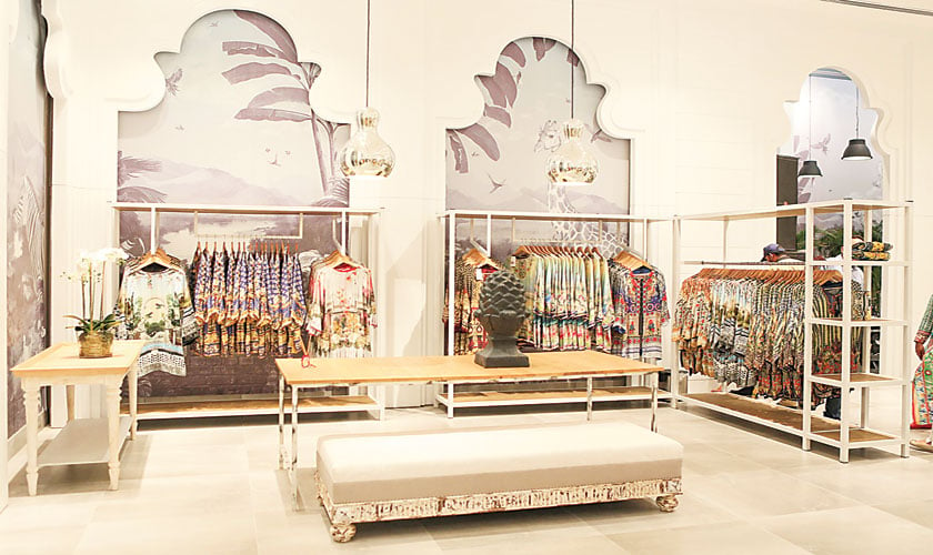
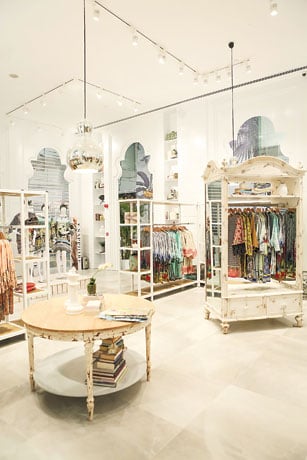 The store housed on the ground floor of the newly constructed Emporium Mall has a distinctive and lively appeal with a contemporary touch. From gigantic display windows to the use of patterned wallpapers and accessories such as dressers, tables, wardrobes, showcases and racks, the place is done just right with maximum space for customers to move around. Indeed, this 'Concept Store' is the biggest operational store in the mall which is designed by Yousaf Shahbaz of Strata featuring an in-house cafe as well. The concept store also offers kids' play area for a seamless retail experience for women and families alike.
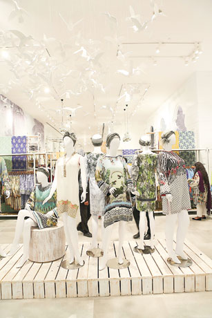
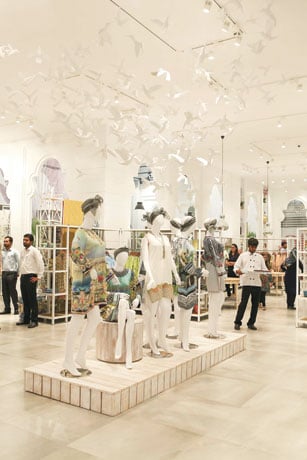
As soon as one enters, the white flying cranes - a symbol of happiness and good fortune - hanging at the entrance gives a serene feeling. According to Yousaf Shahbaz, this project has been really close to my heart. "Firstly it is the biggest store ever and is the first of its kind. It is a high street store modelled after a department store concept. It is also the first outlet to have an in-house cafe and a separate seating and play area for kids. Even designing the programme for this was super fun," he says.
The architectural concept
The luxurious nature of the store is highlighted by a lavish window display that takes centre space. The designer opted for a timeless, all white space adorned with shiny accents, high-quality lighting materials - a combination that brings 'opulence'. "It is also the first time we have taken influence from eastern architectural elements and from the indoor outdoor spatial tectonics of a 'baaradari'. A free standing structure in the middle of lush gardens viewed through a series of arches with humming birds fluttering in and fountains gushing cool water. This base has been layered with influences from European classicism as well as very minimalist modern lines and finishes. Animals and plantation found in tropical rainforests all the way to those found down in Africa peek from here and there; making the whole feel more international and 'resorty' than anything else," shares Shahbaz.
About the design, Khadijah Shah, Creative Director of the brand informs, "When we got this space I instantly knew that my project at Emporium could only be handed by Yousaf Shahbaz. He's the only person who would translate my vision into reality. He developed the ideas further by creating this gorgeous space and we are very happy with it."
 "The cafe again was an idea which I took up from stores abroad and I thought that it's incredibly cute to bring the same concept here. I wanted a courtyard with a fountain in the centre which was inspired by the eastern, more Persian and Moroccan feel. I wanted these arches and hear the sound of water in the store that came in the form of fountain. I wanted the shopping to be around the courtyard sort of an 'eastern inspired haven'," adds Shah.
The product display is done up in a style that nothing is left unnoticed. "The store's 1300 square feet interior evokes a real sense of luxury and spaciousness. A succession of large white pavilions sets the rhythm of the interior, dividing it into different spaces; each dedicated to a different product type and also leading to a central fountain area, kids play gym and an in-house cafe. Painterly murals clad with the brand's signature flora fauna and birds, the fountain, arches and domes in the new concept store provide a dynamic yet relaxed setting of great visual impact; an amphitheatre where the product is at the core," states Shah.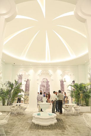
The entire interior has been reconstructed in a careful and precise method to create a fine new chain of spaces; as one area gels into another without forming any hindrances. A double-height ceiling leads to a completely new arrangement with maximum light for the area.
Also, there are unique elements like the hanging steel lights, decorative vases with flower arrangements added to a collection of white mirrors, books and frames giving a feel as if it has been gathered over time.
White is predominant, however, other colours also dot the interior through jungle scene wallpaper, abundant placement of planters and the vivid products on display. The store is highlighted by a dome like sculpture that spans the courtyard where there's enough seating for families to sit down and take a breather as they shop.
Emphasis has been given to quality materials chosen for the implementation of the project - stone tiled flooring, wooden furniture, lighting installations, see through glass showcases with a range of sparkly jewels - are pleasing to the eye. The design incorporates a diverse mix of materials including a marbled fountain gushing out bubbles, arches, tall white pelicans with display boxes, wall finishes, sofa seating around wooden tables, standing mirrors, steel racks and brass detailing.
The glamorous appeal and sophistication that have always been the brand's main attributes are reflected in the comfortable yet striking interior of the store.