Twitter announces new look for icons
Twitter spokesperson Shaokyi Amdo says icons would be soon available on web, iOS, and Android
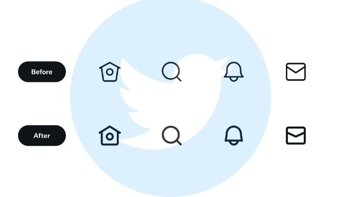
Microblogging platform Twitter announced Saturday that is introducing a new look for the icons used on the platform. The icons look better angled and have thicker outlines.
"Good is good but better is better," Twitter believes.
The announcement was made via a Twitter thread. The post read: "The goal was to create a cohesive set of icons that are bold in shape and style yet still relatable and a little cheeky where possible."
The thread includes a before and after image of the icons to understand the differences better. The post also said that it will be adding "more to the set".
Twitter spokesperson Shaokyi Amdo told The Verge that the icons would be soon available on the web, iOS, and Android.
The changes come after the tech giant introduced a fresh visual design language last year.
-
Shanghai Fusion ‘Artificial Sun’ achieves groundbreaking results with plasma control record
-
Polar vortex ‘exceptional’ disruption: Rare shift signals extreme February winter
-
Netherlands repatriates 3500-year-old Egyptian sculpture looted during Arab Spring
-
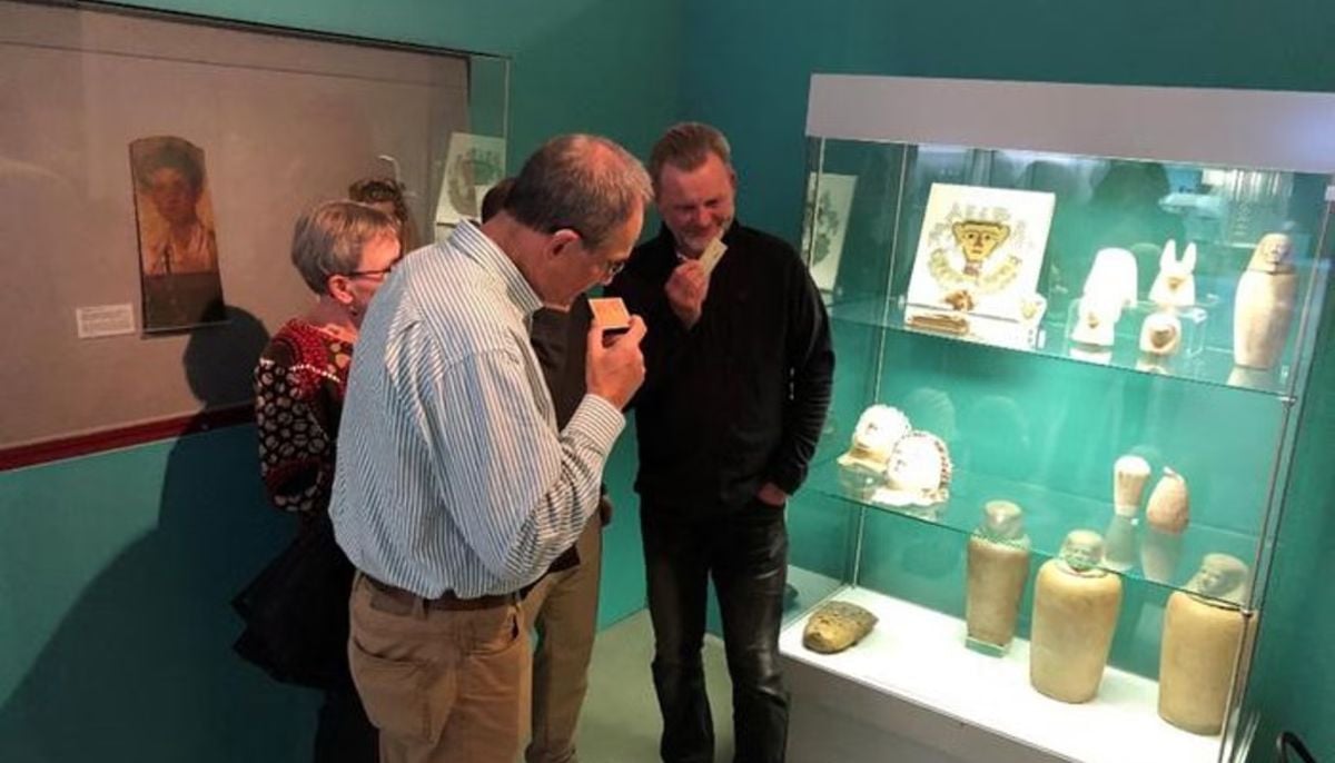
Archaeologists recreate 3,500-year-old Egyptian perfumes for modern museums
-
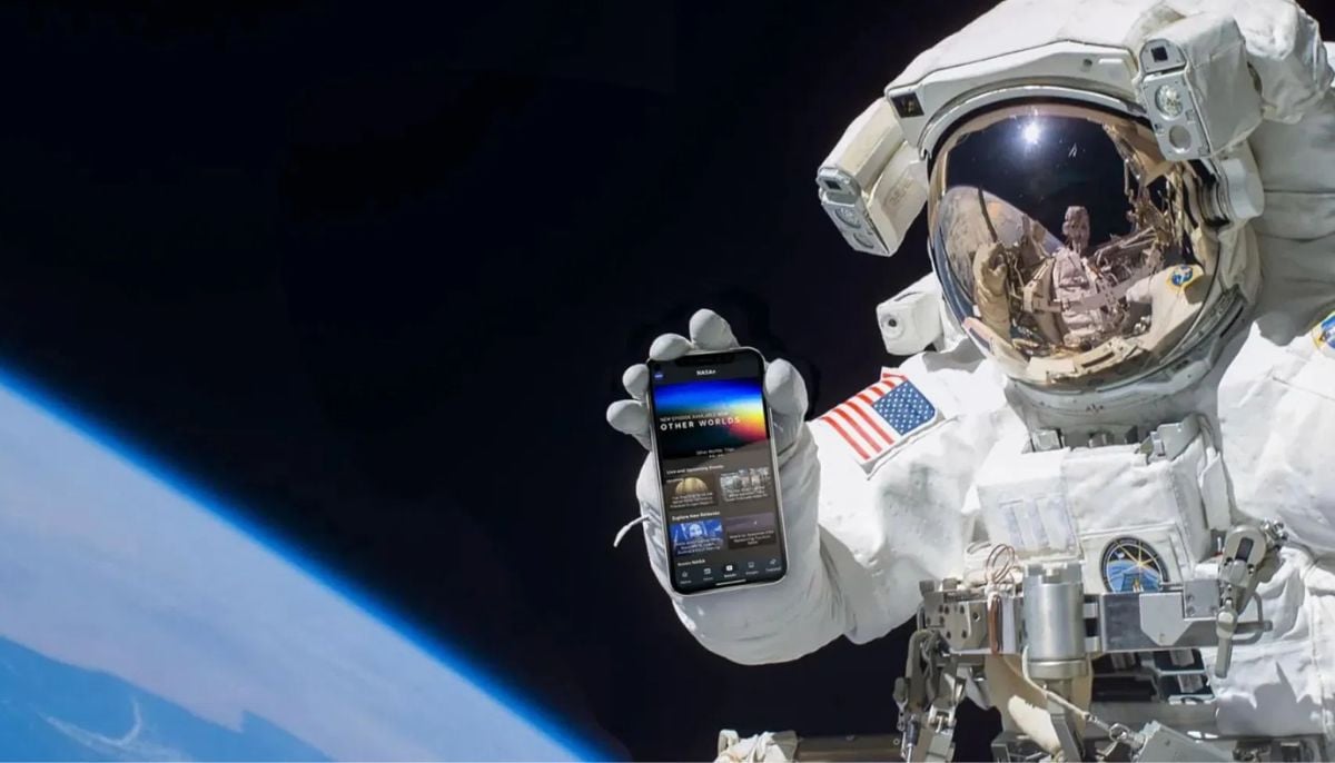
Smartphones in orbit? NASA’s Crew-12 and Artemis II missions to use latest mobile tech
-
Rare deep-sea discovery: ‘School bus-size’ phantom jellyfish spotted in Argentina
-
NASA eyes March moon mission launch following test run setbacks
-
February offers 8 must-see sky events including rare eclipse and planet parade
